Featured
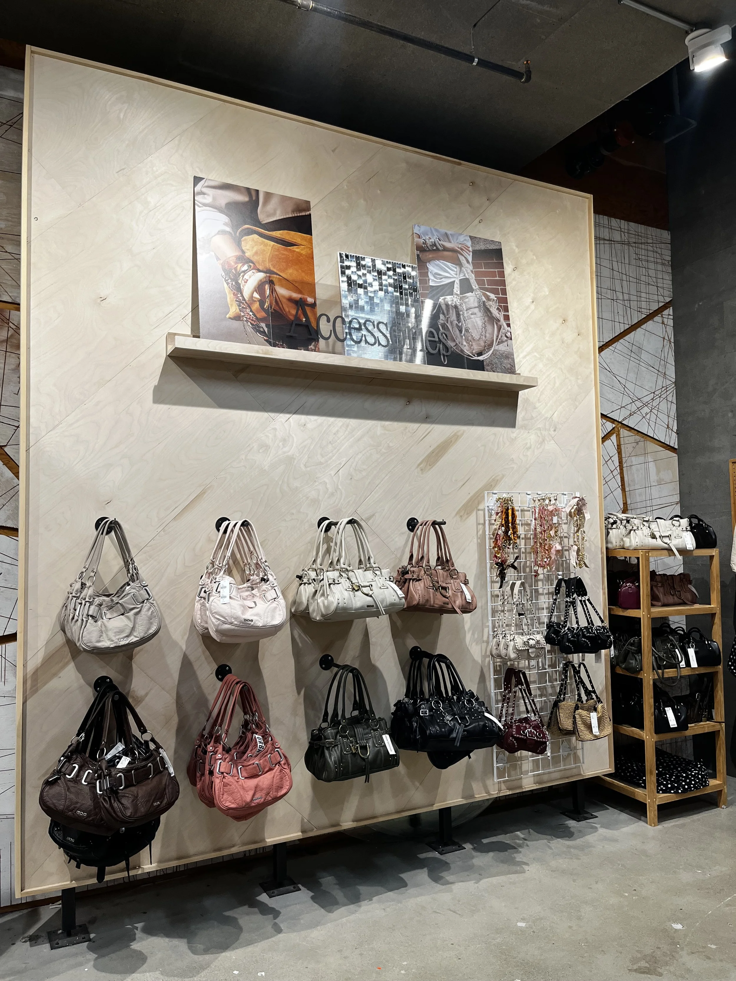
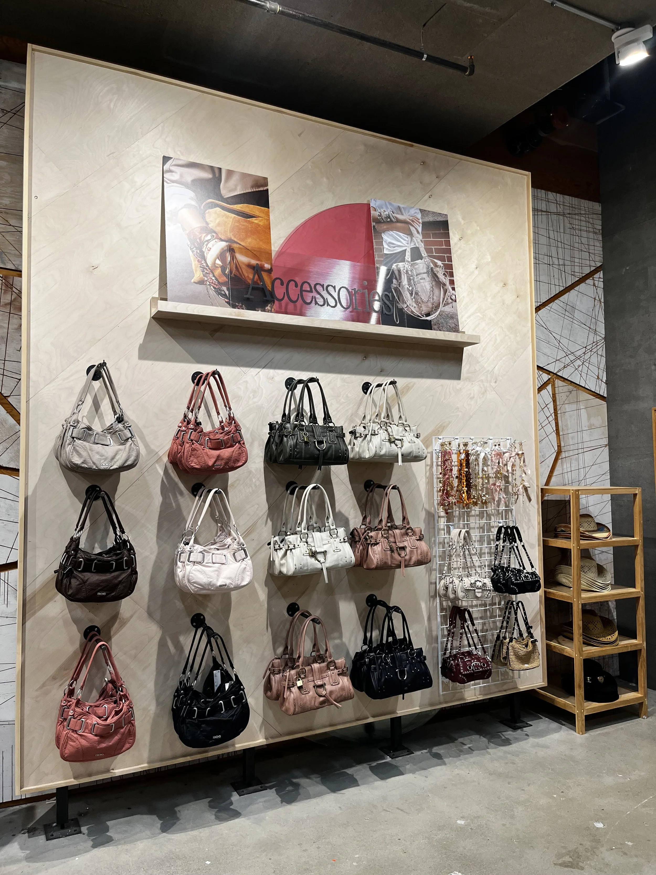
Objective: Reconfigure the primary accessories display to reflect Spring delivery while optimizing for high inventory levels in specific handbag SKUs.
Execution: Transitioned the color story from heavy neutrals and dark tones to a brighter, Spring-forward palette featuring soft pinks, creams, and sage.
Increased capacity by moving from a 2-tier to a 3-tier “waterfall” hanging system, allowing for a 50% increase in face-out product density without crowding the visual field.
Introduced a custom pink acrylic geometric element to the focal point (shelf-top) to break up the linear wood grain and provide a modern, seasonal pop that draws the eye upward.